Rock Region Metro
UI/UX Design
Consolidating essential features to improve accessibility, rider retention, and public trust
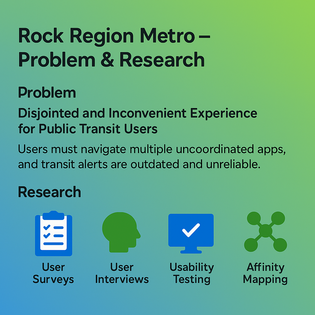
Rock Region METRO faced a 30% drop in ridership and a 20% reduction in drivers — a challenge compounded by fragmented digital tools that made navigating the transit system frustrating for users. Through user surveys, interviews, usability testing, and affinity mapping, we uncovered a major barrier: riders were forced to use separate apps for bus routes, ride scheduling, and fare payments. On top of that, alerts were outdated, notifications were unreliable, and key features redirected users to clunky web-based systems.
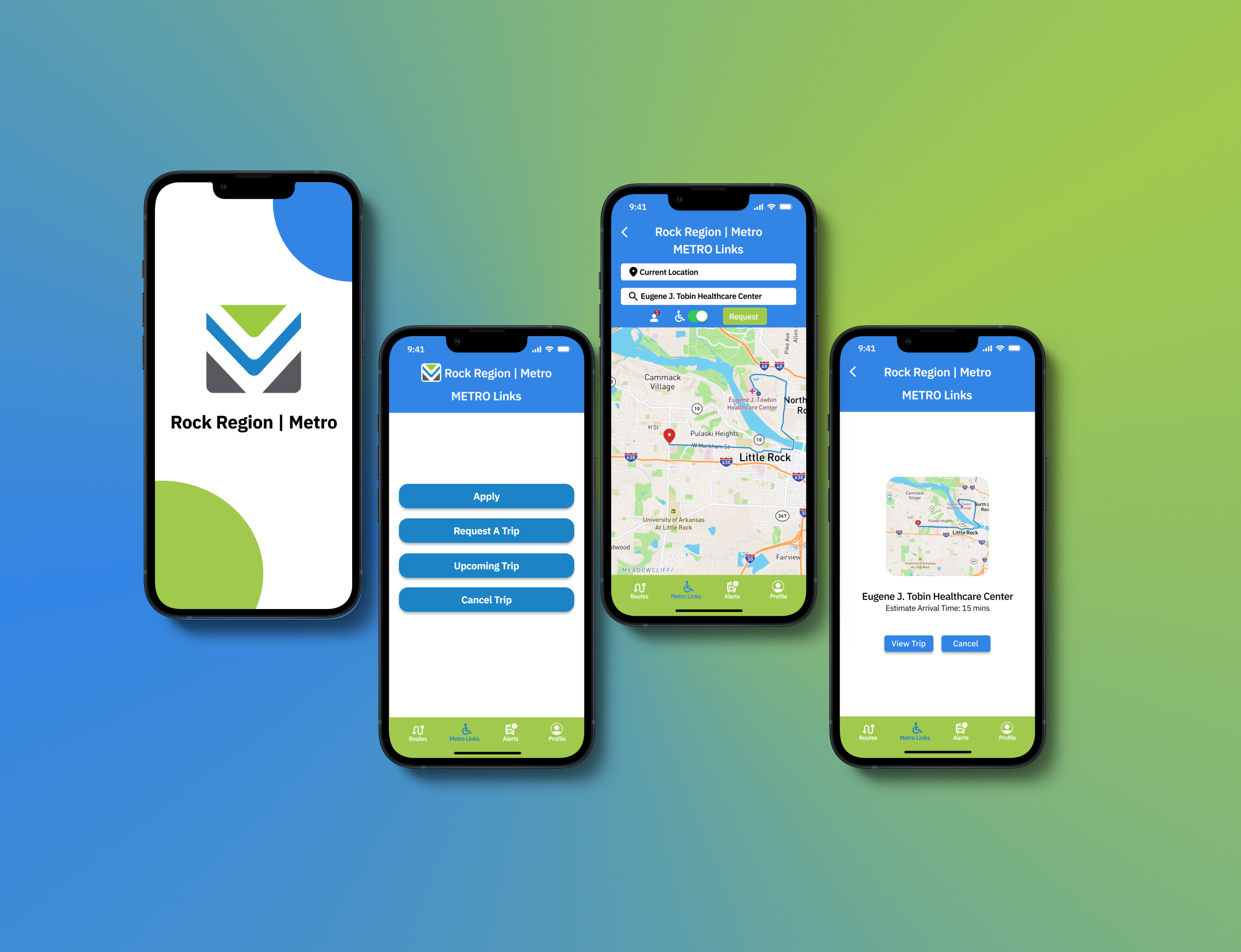
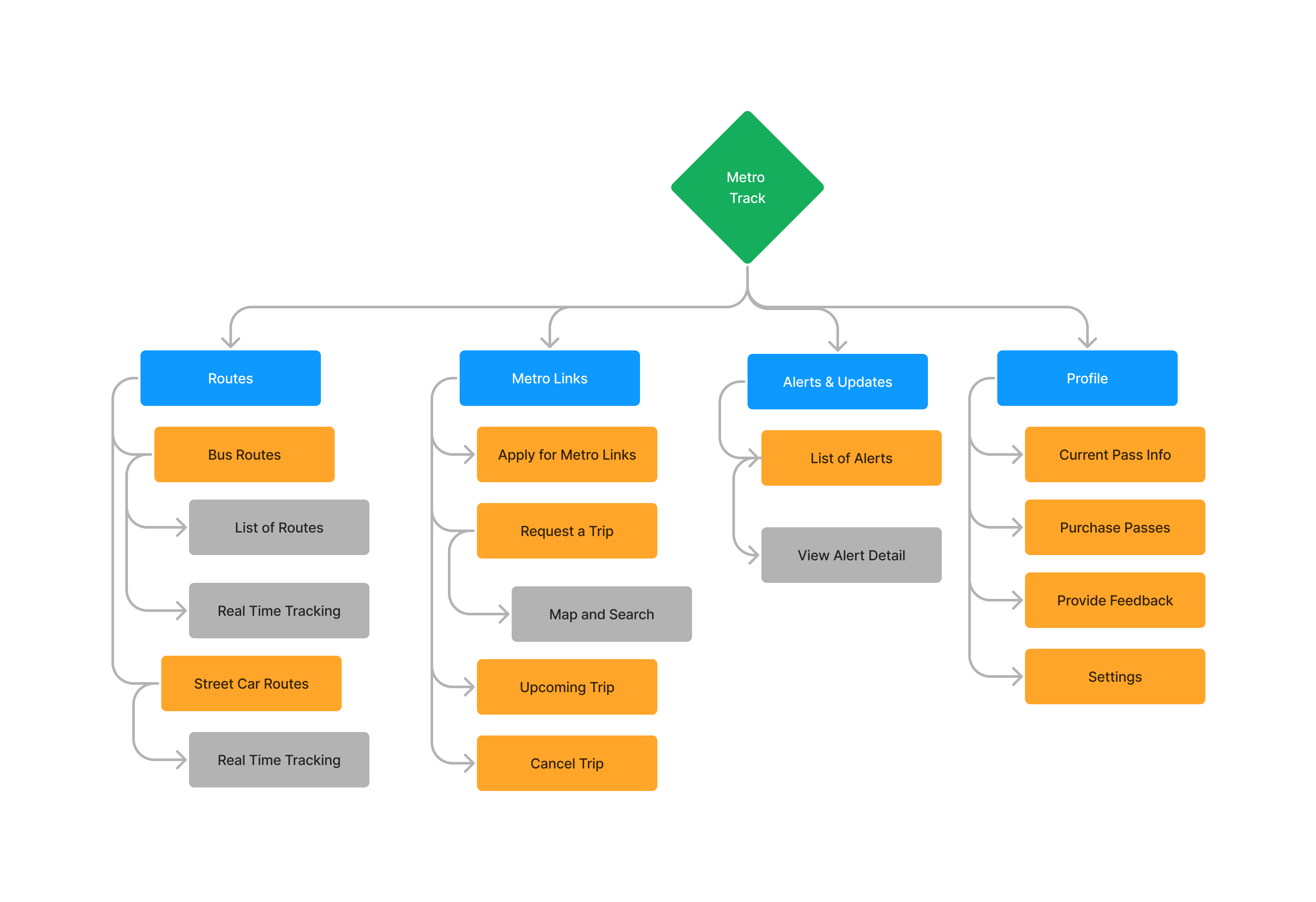
The solution? A single, unified mobile app designed to centralize core transit functionalities — allowing riders to check real-time routes, receive push notifications, purchase passes, and schedule rides all in one place. Using Figma, we built a clean, accessible interface backed by a simplified information architecture and minimum viable product (MVP) that prioritized clarity, trust, and ease of use.
This project not only modernized the Rock Region METRO user experience but also set a foundation to increase passenger engagement and rebuild long-term loyalty.
The Problem
A challenge compounded by fragmented digital tools that made navigating the transit system frustrating for users.
A single, unified mobile app designed to centralize core transit functionalities — allowing riders to check real-time routes, receive push notifications, purchase passes, and schedule rides all in one place.
Using Figma, we built a clean, accessible interface backed by a simplified information architecture and minimum viable product (MVP) that prioritized clarity, trust, and ease of use.
Need a clean, professional site that gets straight to the point?
Let’s build something that works as hard as you do.
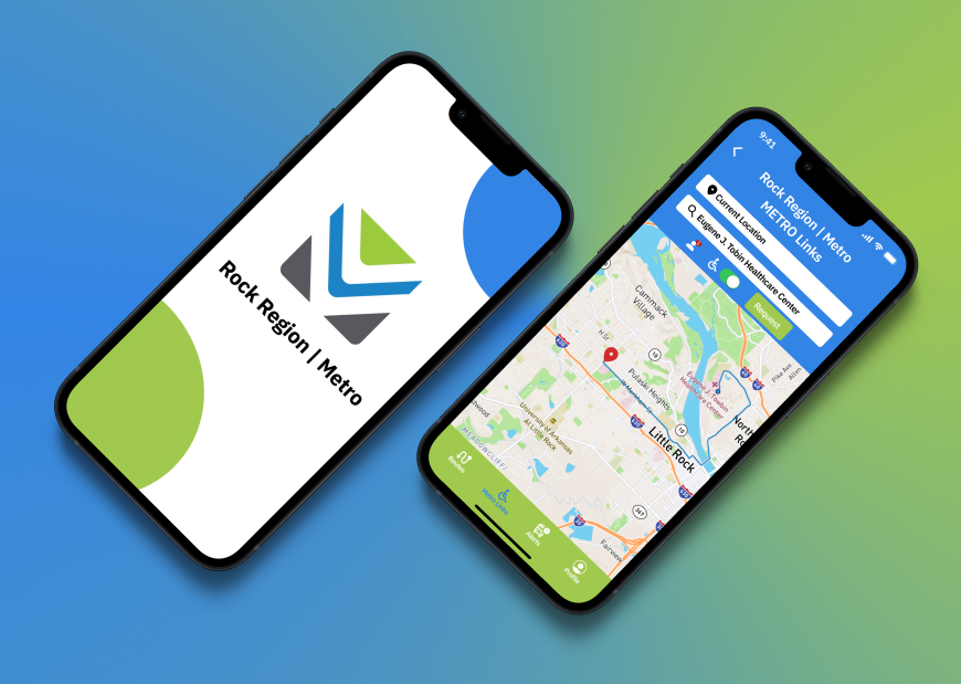
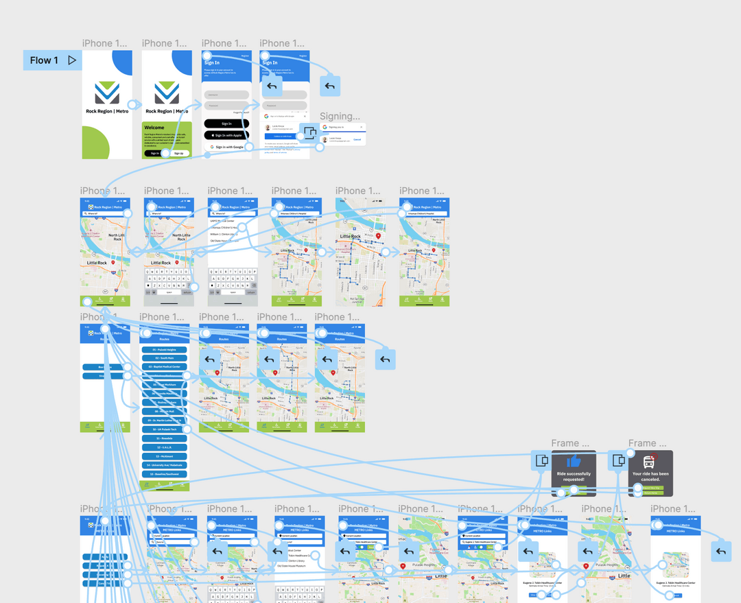
Interactive Prototyping for a Unified Experience
Using Figma, we developed a high-fidelity prototype. By leveraging reusable components and variants, the prototype allowed for efficient iteration and testing—helping validate UX decisions, streamline user flows, and simplify future development handoff.
Project Timeline Overview
Our project timeline outlines the key phases from start to finish. Each milestone represents a significant step towards achieving our goals.
Start
Project Kickoff
Identified critical pain points: fragmented applications for scheduling, navigation, and payments; unreliable transit alerts; and a convoluted pass purchasing process. 
Development
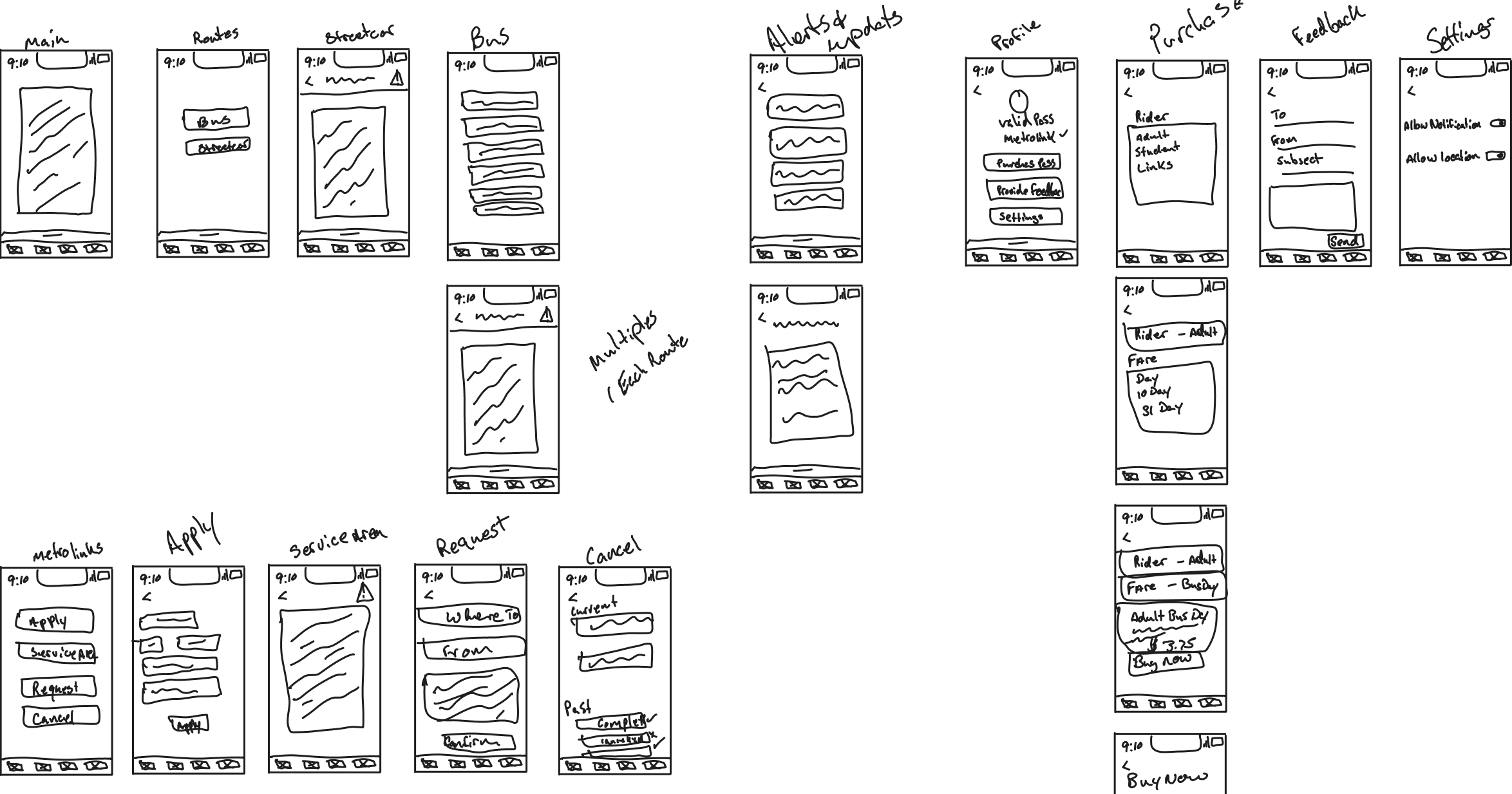
Design and Build
We consolidated multiple functionalities into a single, intuitive mobile application. Utilizing Figma, we crafted a responsive design that integrated route planning, real-time updates, and in-app pass purchases. The design maintained brand consistency while prioritizing user accessibility and streamlined navigation.
Launch
Final Review
The high-fidelity prototype underwent rigorous usability testing, ensuring seamless user interactions and functionality. Feedback loops allowed for iterative improvements, culminating in a polished product ready for deployment. The unified app aimed to reduce user frustration and encourage increased ridership.
Post-Launch
Ongoing Support
This project did not require ongoing support, but the research and content was reviewed and filed for future project edits.
Project Showcase
Explore the evolution of our design process.
Contact Us
We’re here to answer your questions and assist you.